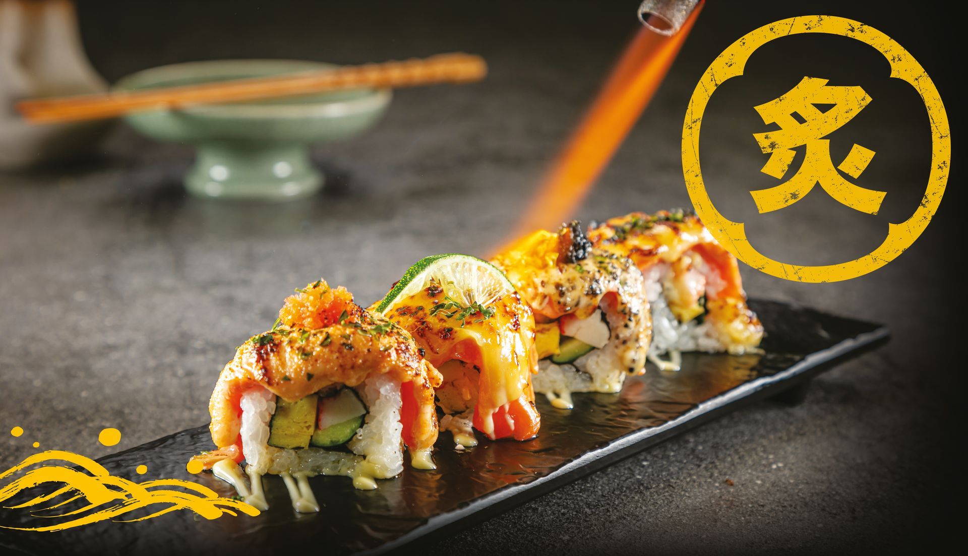
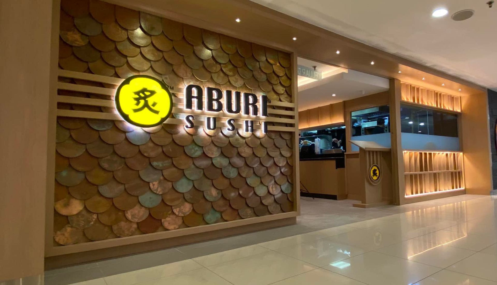
Aburi Sushi is a Reasonable & affordable flame-seared Japanese dishes.
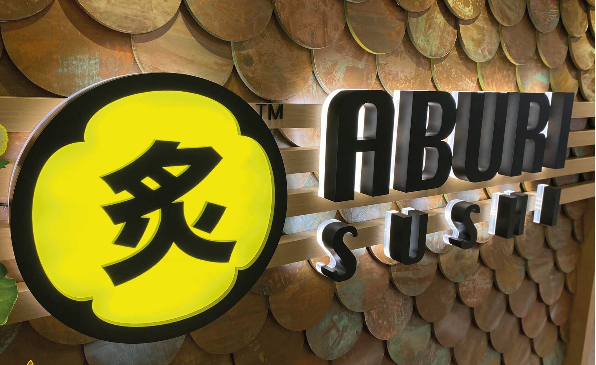
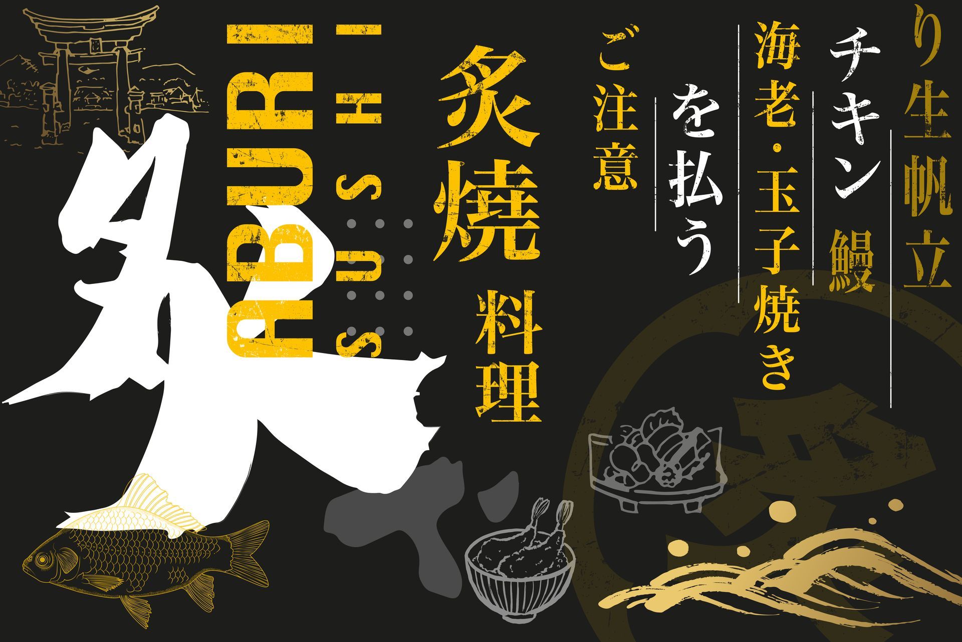
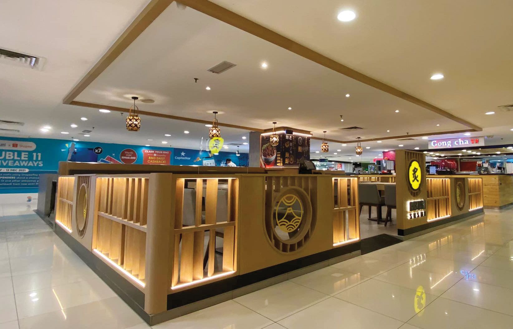
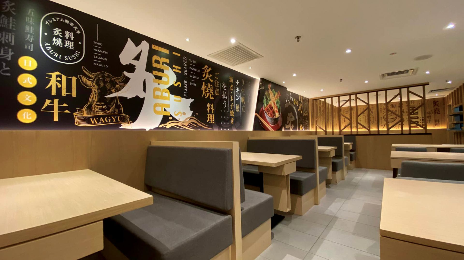
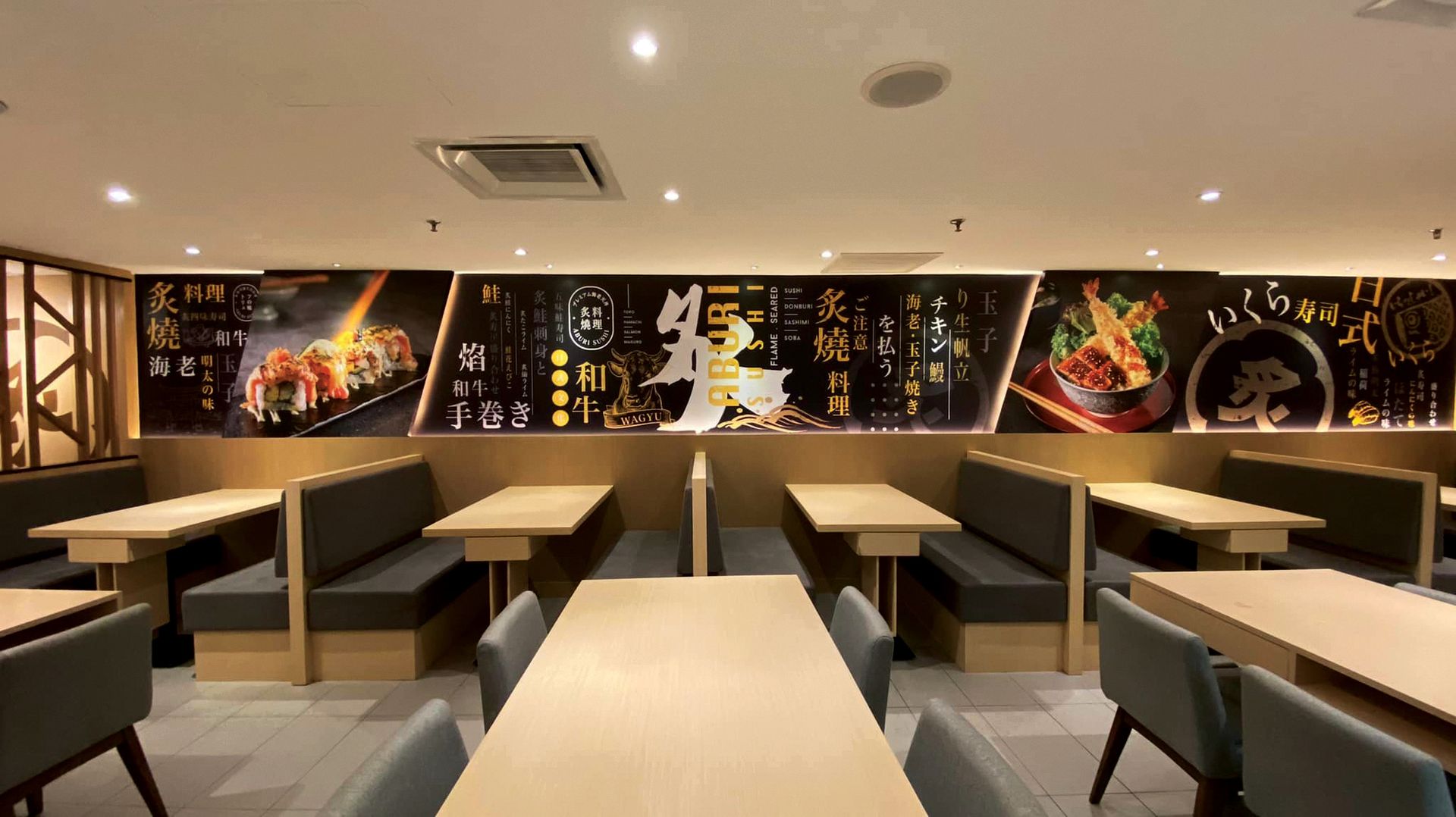
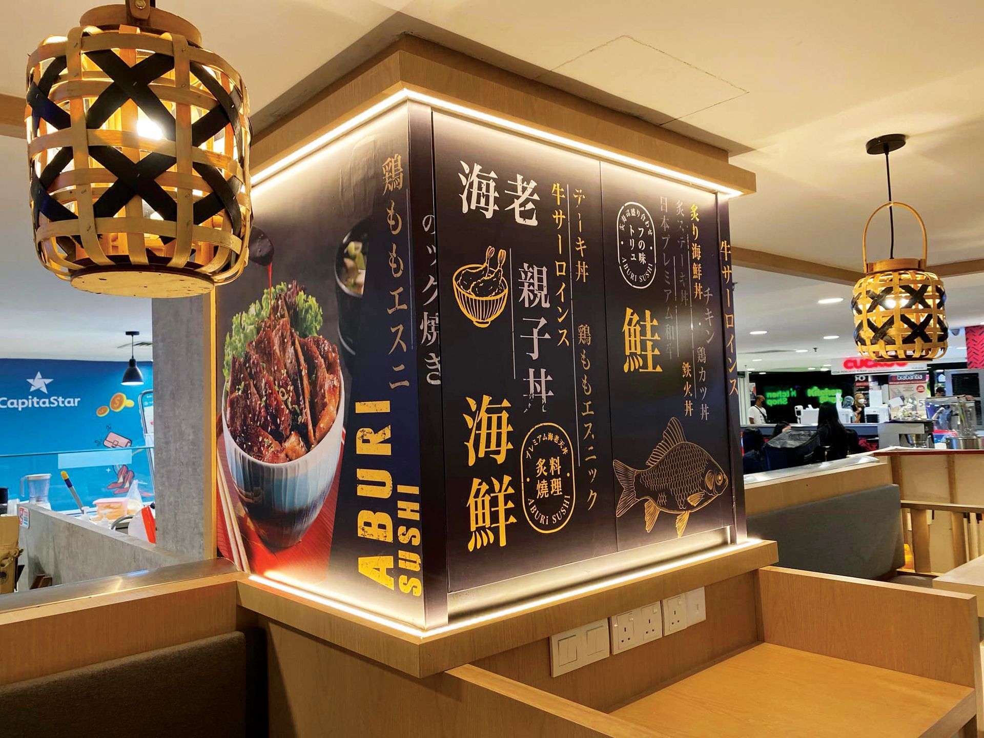
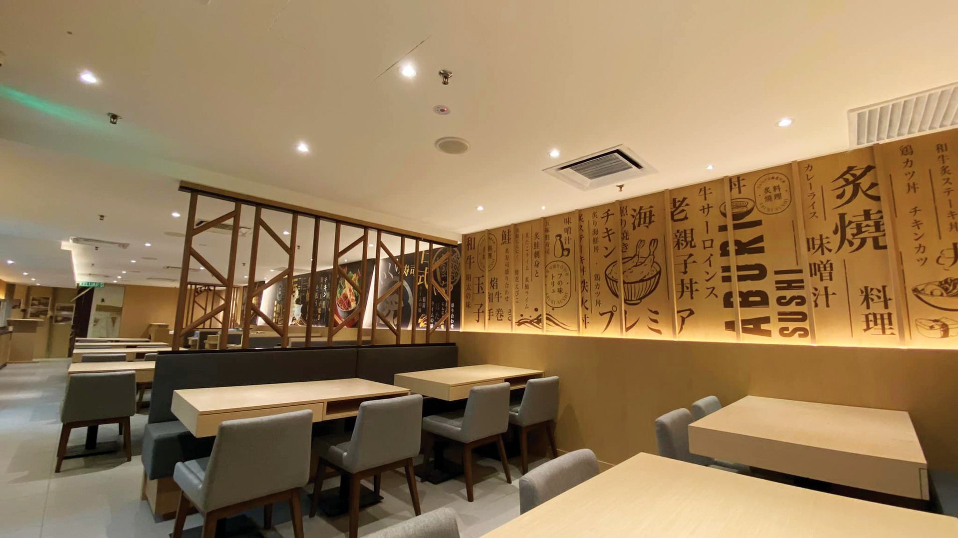
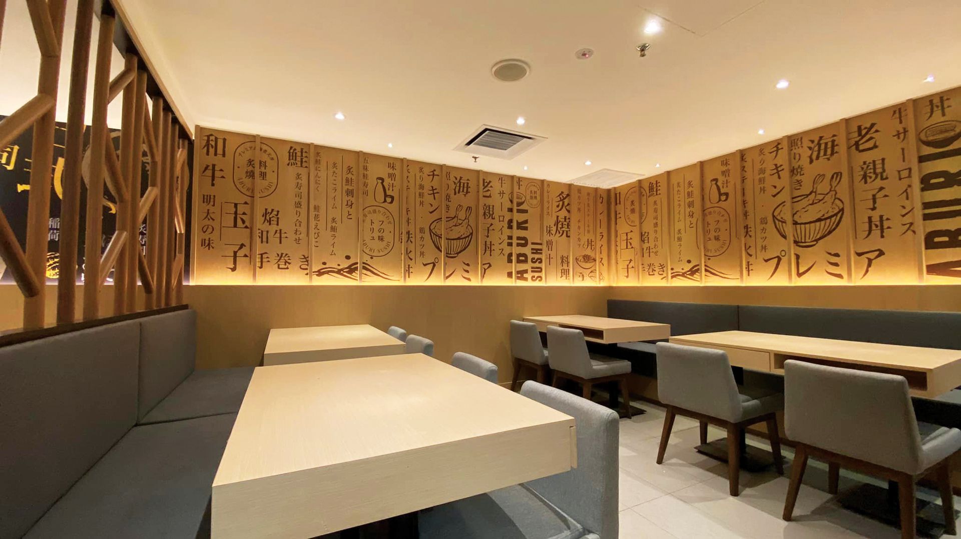
With a decor palette that beautifully juxtaposes black and bright yellow, setting the stage for a bold and striking visual journey.
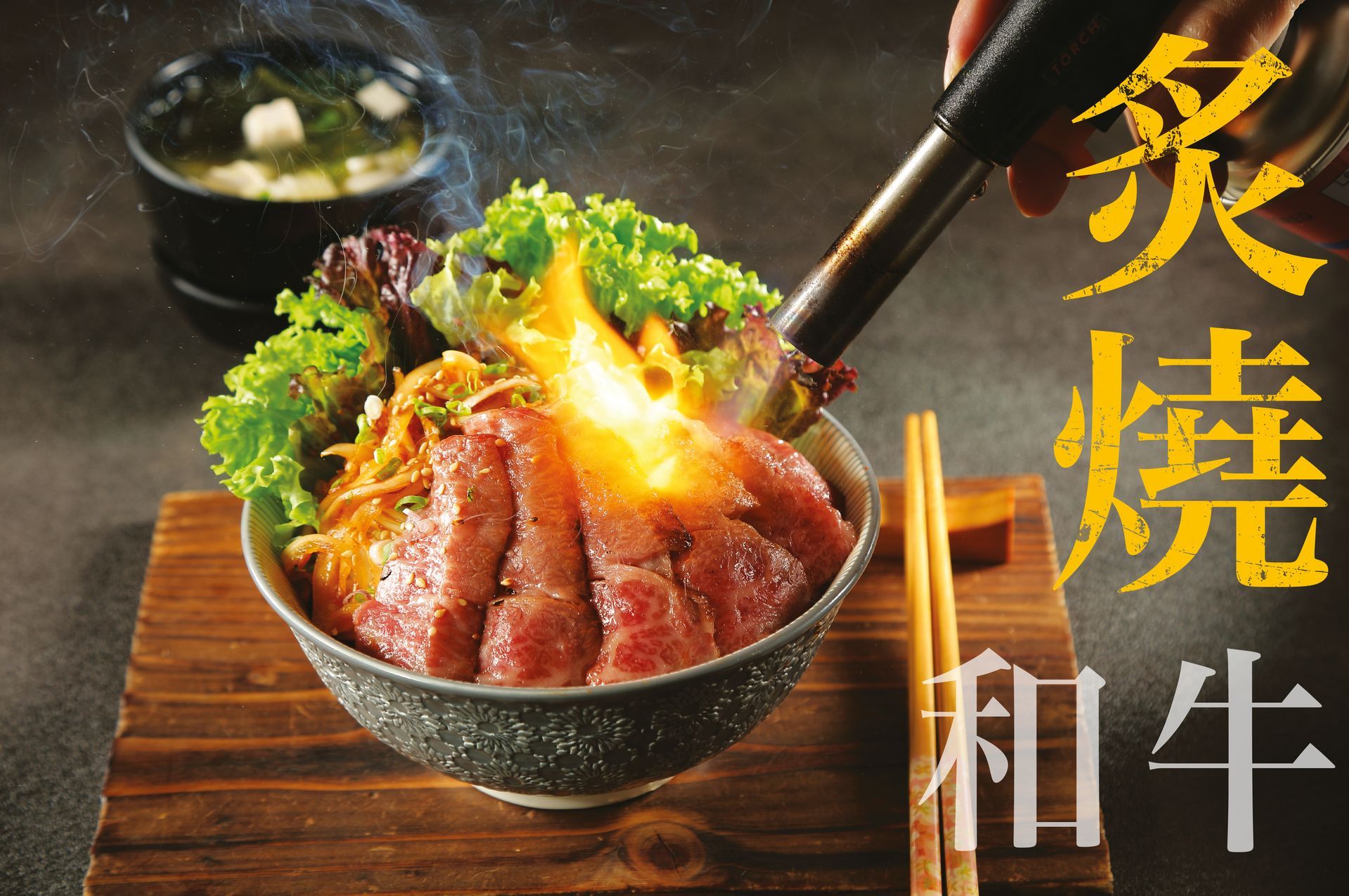
Large-scale Japanese calligraphy and intricate illustrations as the brand visual identity ,create a visually striking and memorable ambiance.
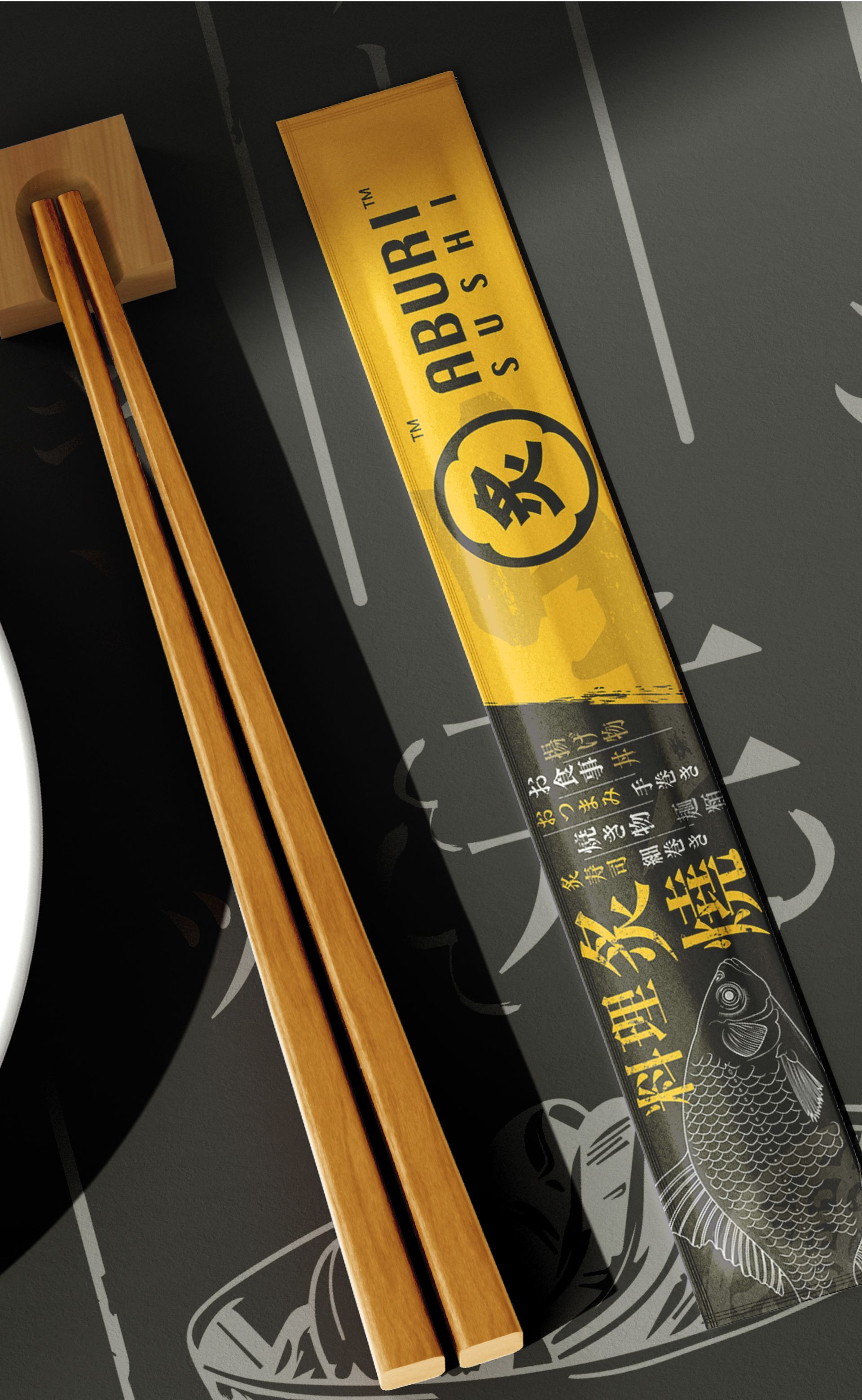
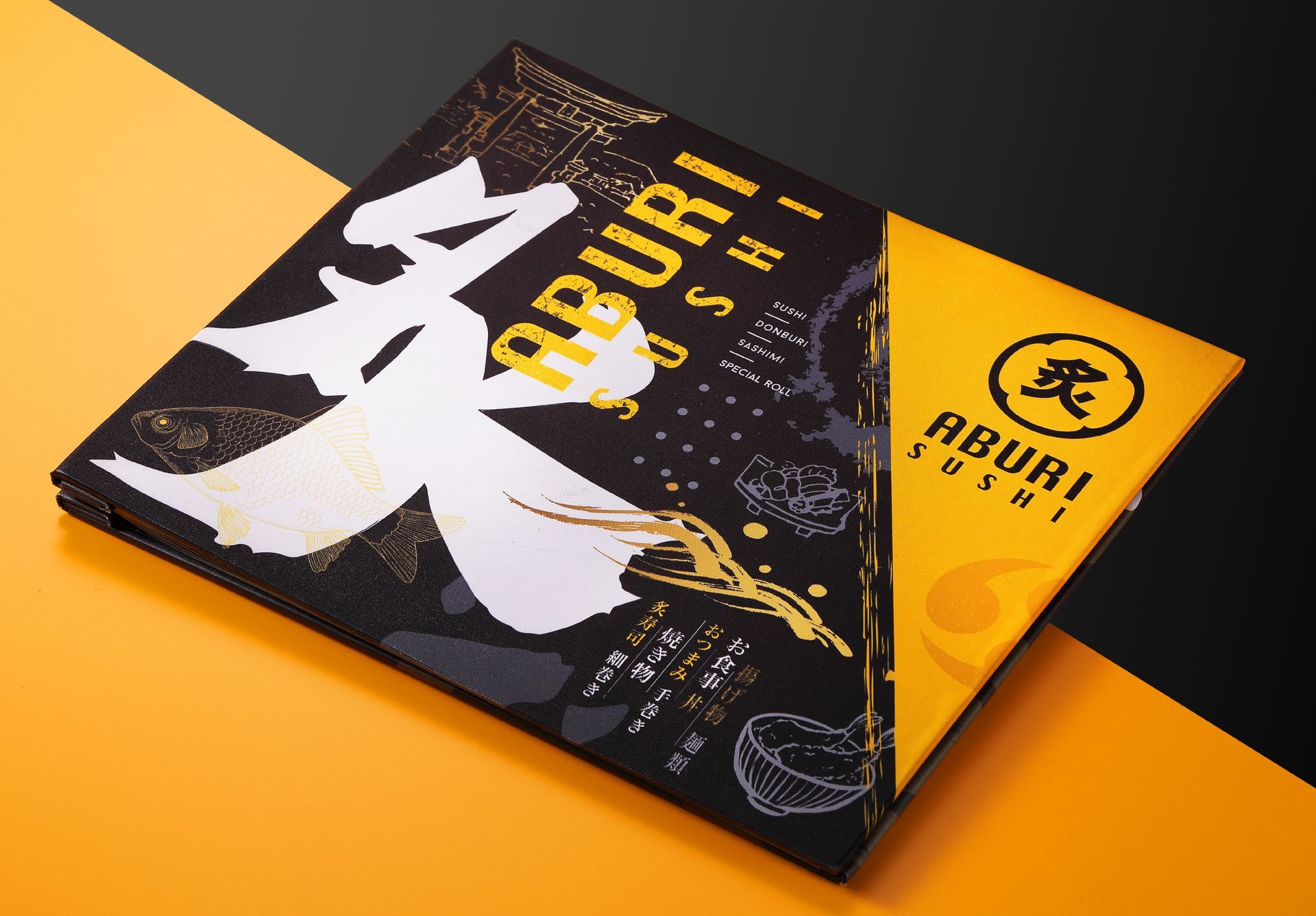
The term "炙り" (aburi) in Japanese signifies direct flame-searing and carries connotations of deliciousness and popularity in Chinese. By fusing this concept with traditional Japanese crests, it conveys the brand's distinctive features directly.
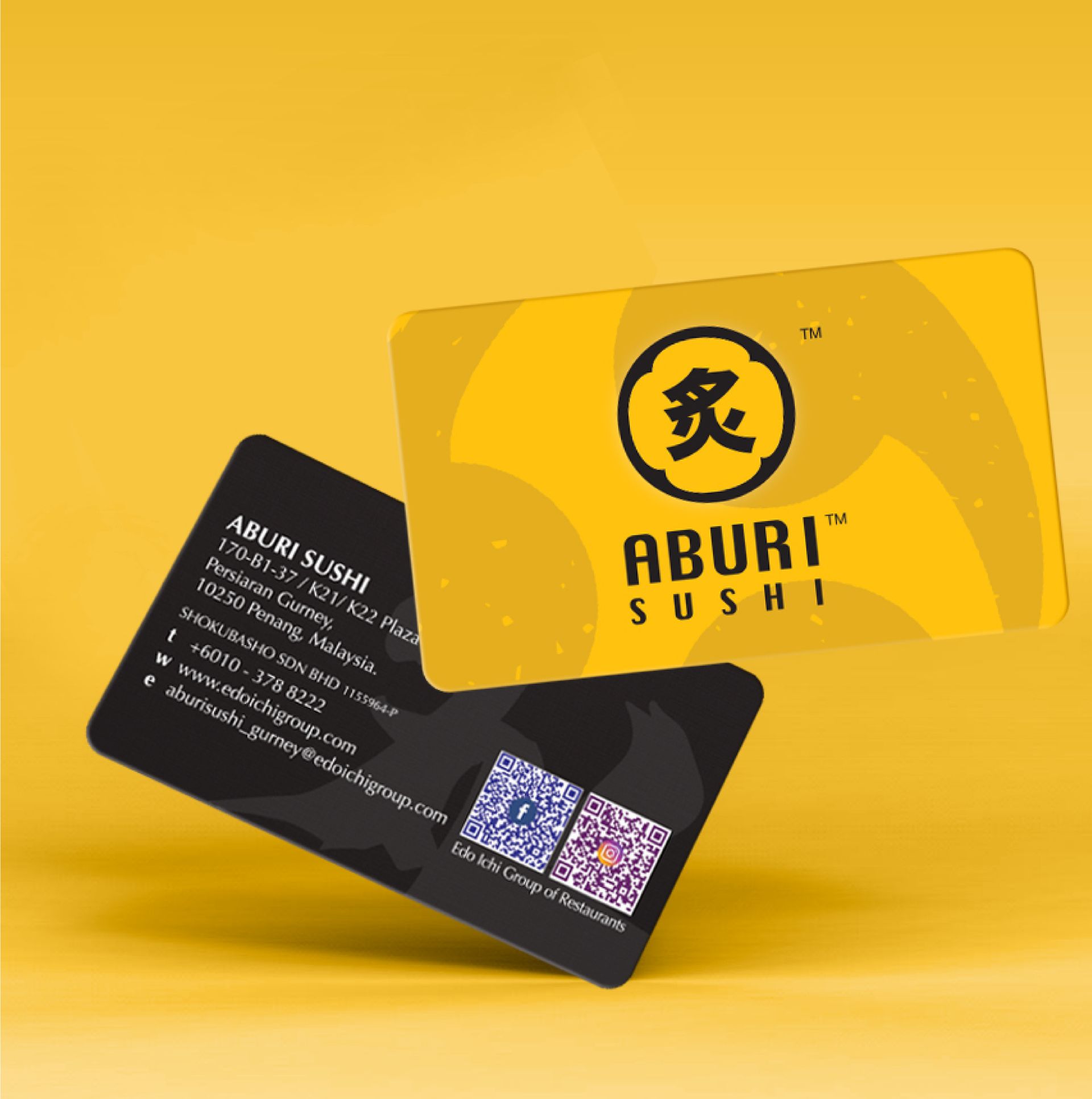
The logo utilizes bright yellow and black colors, giving the brand an initial, distinct, and lively image.
Aburi Sushi是一家价格亲民的直火炙烤日本料理餐厅。
装饰色调巧妙地将黑色和明亮的黄色相互对比,为顾客展现大胆而引人注目的视觉之旅。利用大规模的日本书法和插图装饰墙壁,致力于创造引人注目和难以忘怀的视觉氛围。
"炙り"(Aburi)在日语中有直火燒烤的意思,在中文里也有美味和受欢迎的之意。
团队利用炙一词与日本传统家纹图腾结合,直接明了地传达品牌特色。
商标颜色上使用鲜黄和黑色,给予品牌鲜明以及活泼的形象。