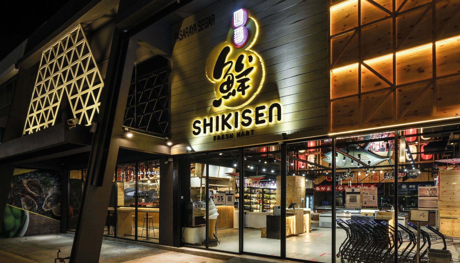
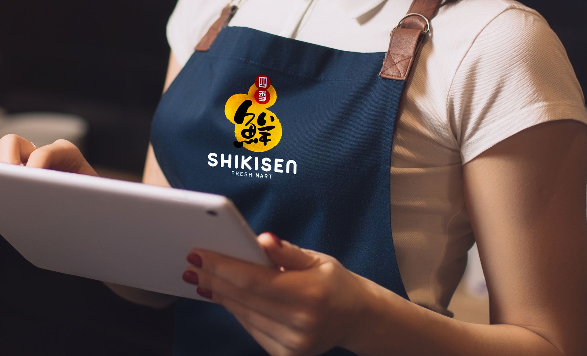
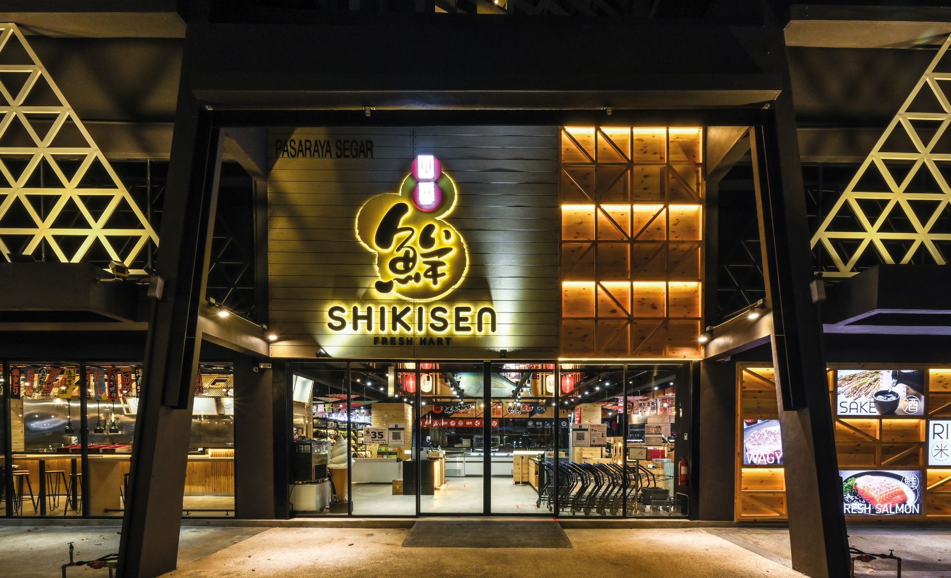
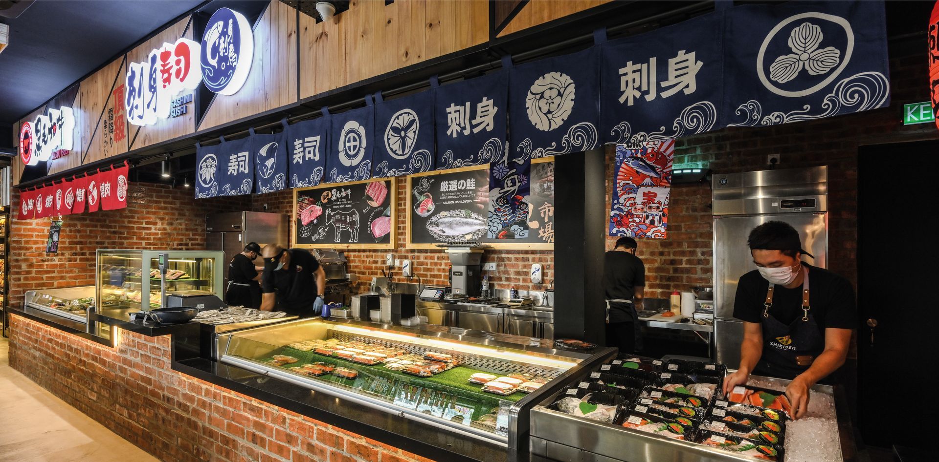
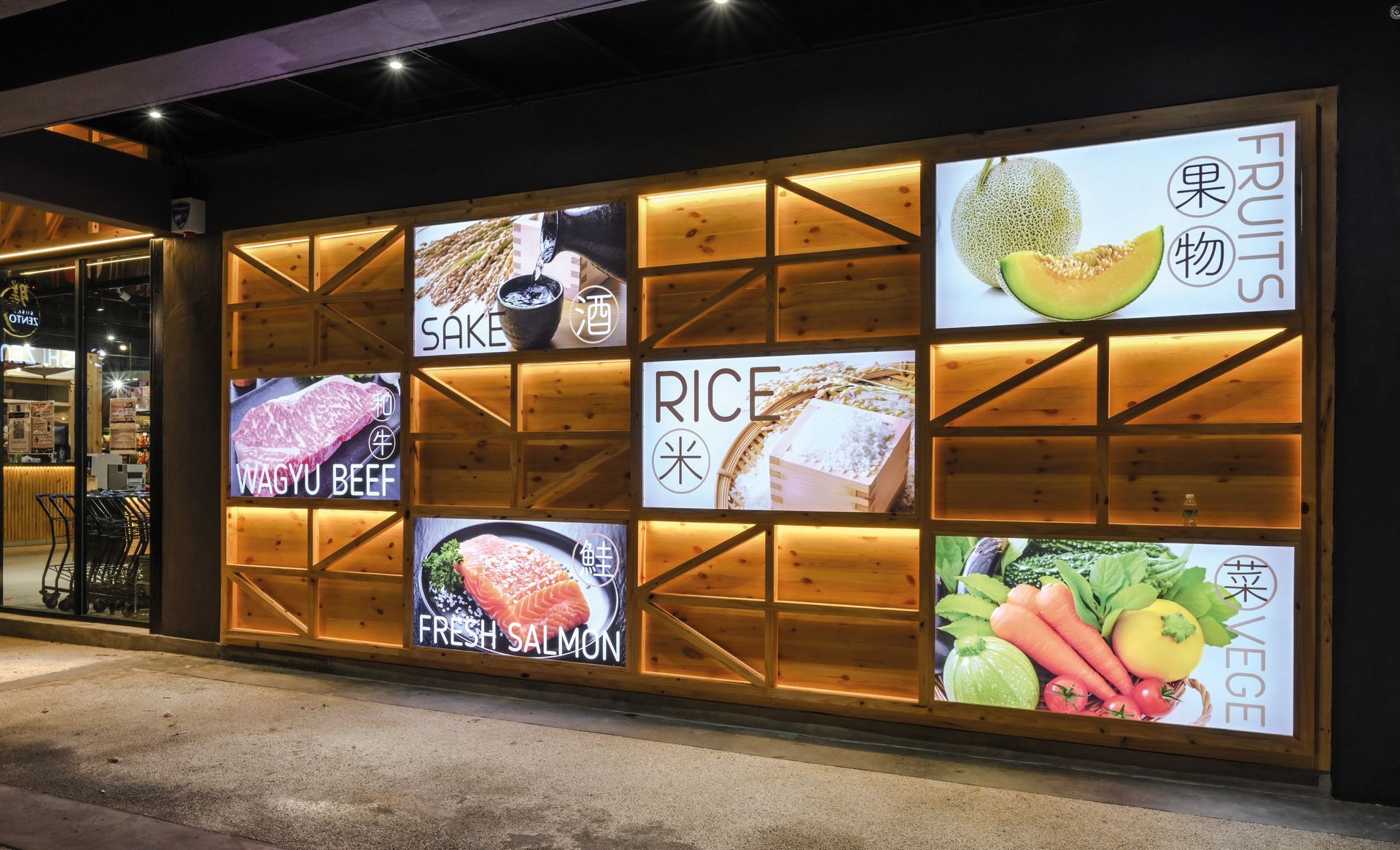
Shikisen is a large Japanese fresh market that specializes in importing the freshest seasonal products from Japan. We have emphasized a brand image that exudes youthfulness and vibrancy.
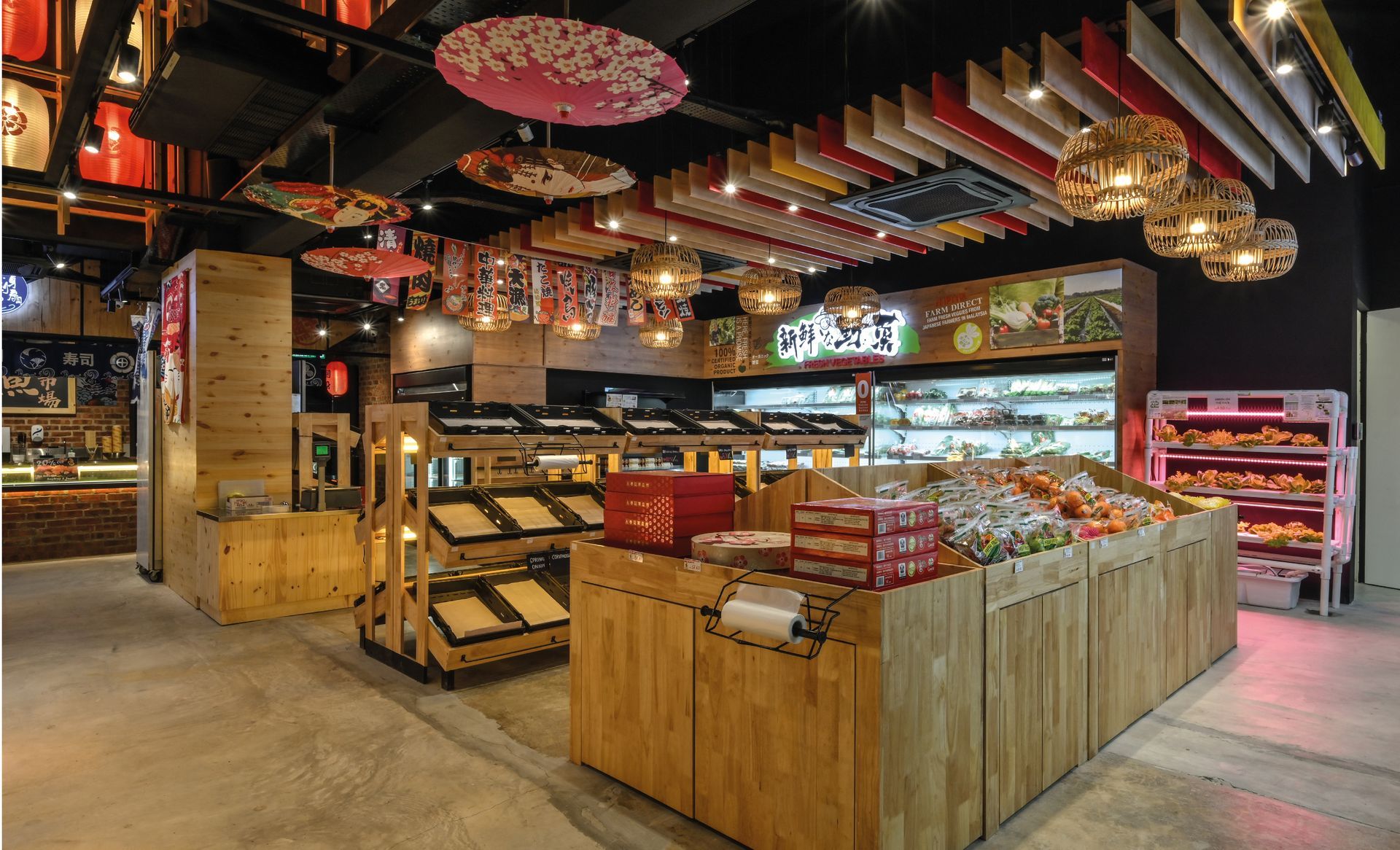
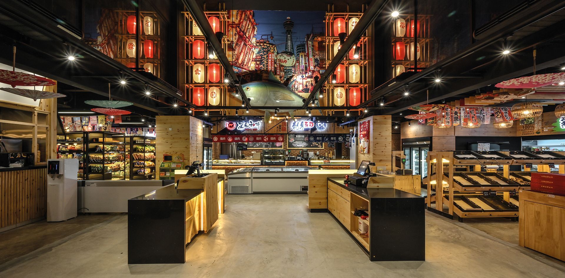
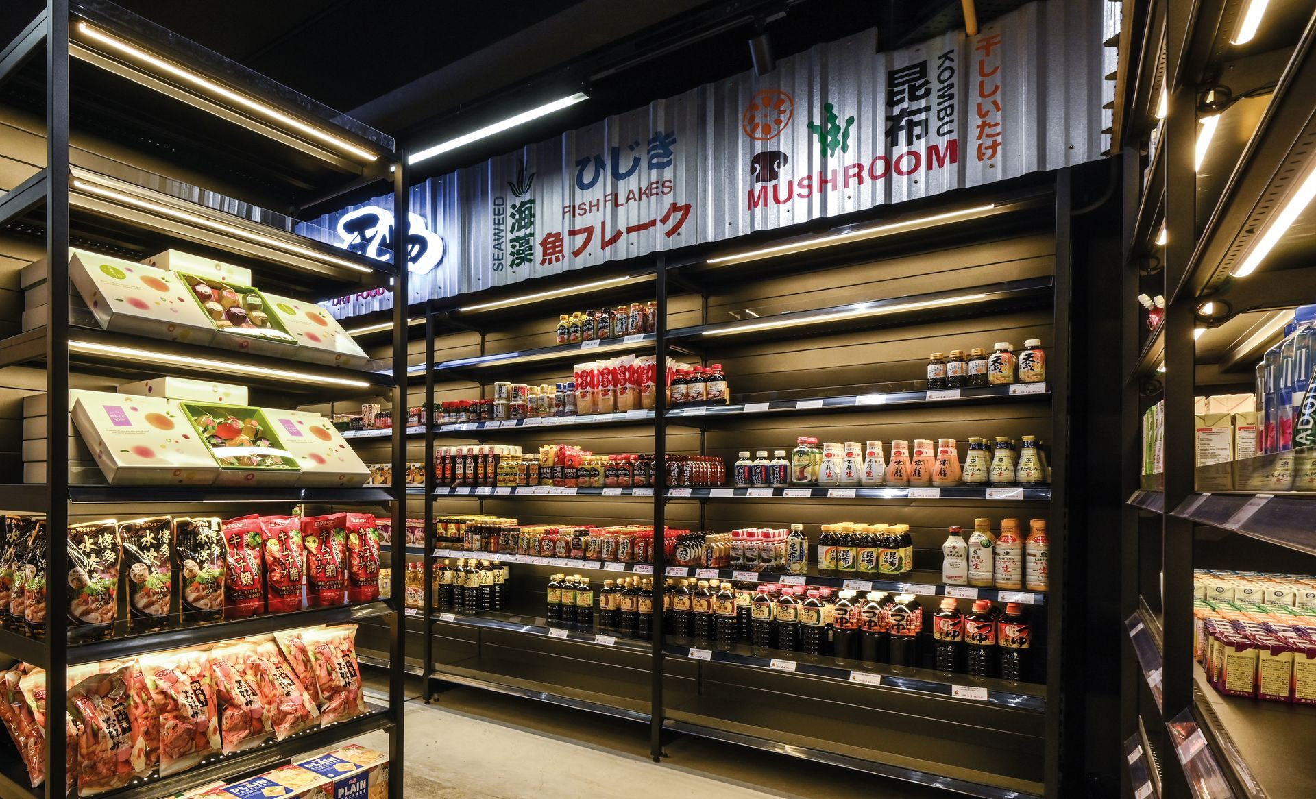
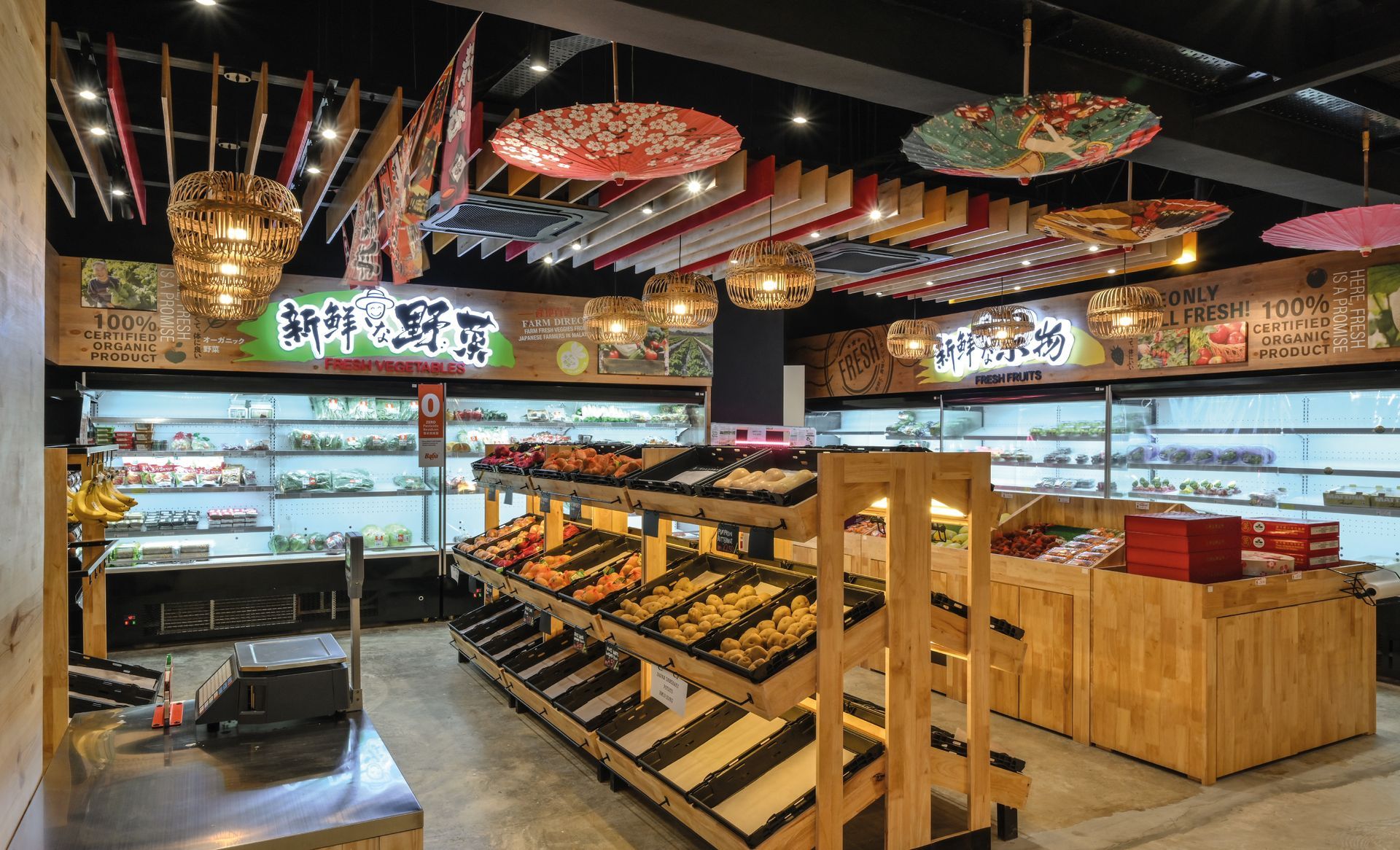
The interior design incorporates elements with a natural feel, such as wooden textures, creating an overall bright and comfortable atmosphere.
We have also incorporated some Japanese typography, lanterns, and traditional Japanese umbrellas to infuse the space with a sense of Japanese aesthetics and culture.
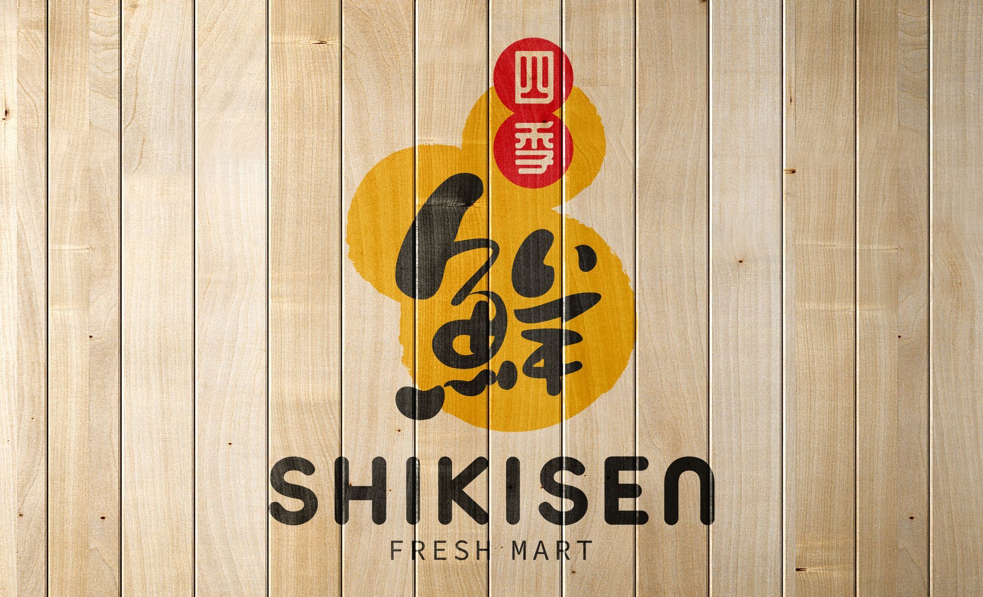
The name "SHIKISEN" means the market offers a variety of fresh products, aligned with the different seasons.
The Japanese calligraphy chosen for the brand adopts rounded brush strokes to convey a sense of relaxing and everyday living. The use of bright and bountiful yellow in the color scheme symbolizes abundance and radiance.
It conveys a sense of authenticity, quality, and connection to the natural rhythms of the seasons, which aligns well with the principles of a Japanese fresh mart.
Shikisen 是一间大型的日本产品生鲜市场,主打进口日本每个季节最新鲜的生鲜产品。
我们为它的品牌形象强调了年轻活力,富有生命力的感觉。
室内设计上使用带有大自然感觉的木纹元素,整体明亮舒适,加入了一些日文字体,灯笼以及日本伞添加日本风情,以赋予空间日本美学和文化的感觉。
"SHIKISEN"这个名字意味着市场提供与不同季节相吻合的各种新鲜产品。
品牌选择的日本书法采用了圆润的笔触,传达一种轻松和日常生活的感觉。
色彩方案中明亮丰盛的黄色象征着丰富和光彩。
它传达了一种真实性,质量和与季节的自然节奏的联系感,这与日本新鲜市场的原则非常吻合。