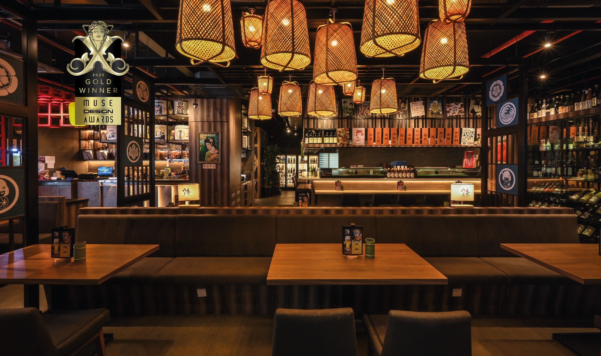
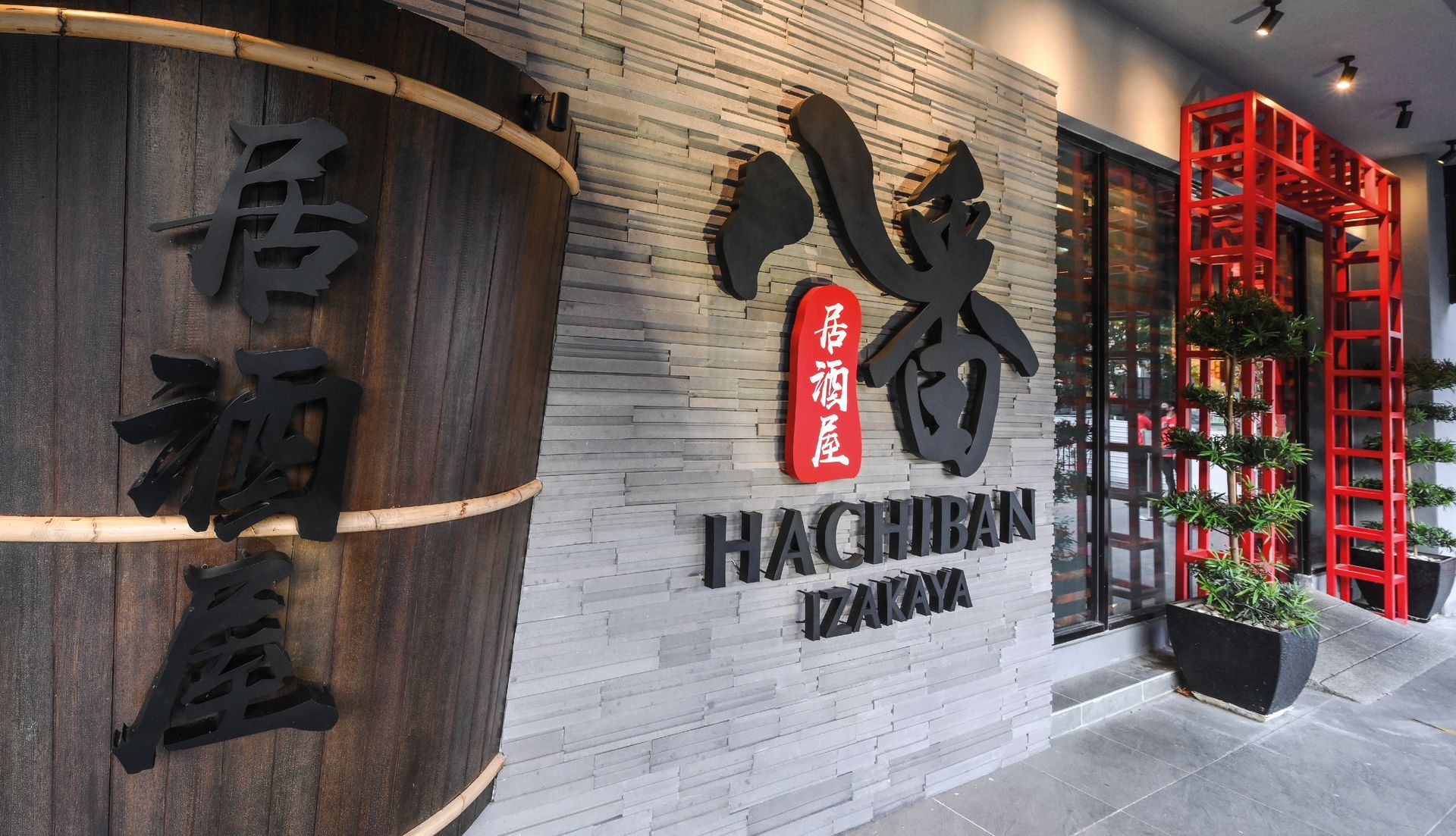
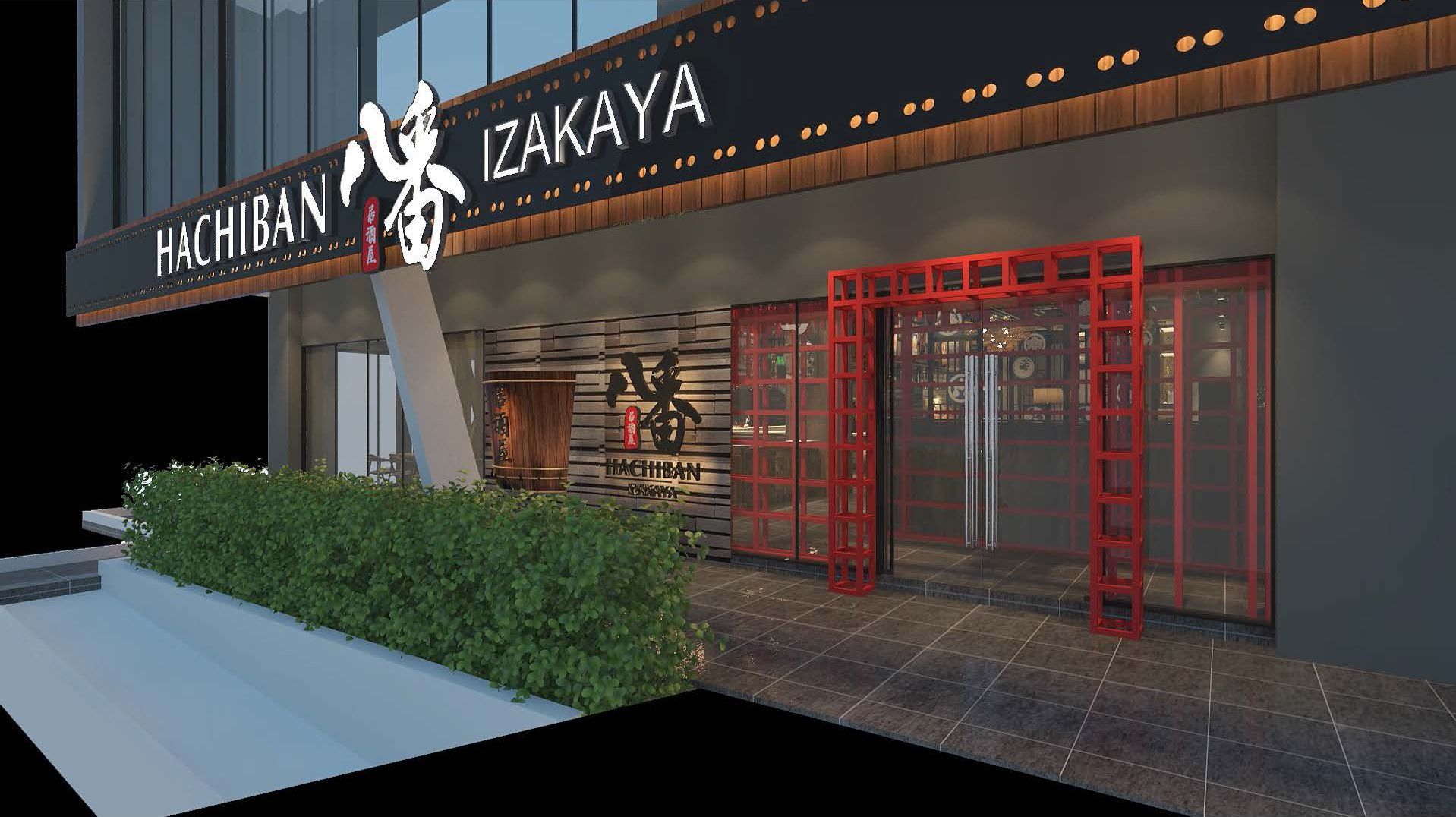
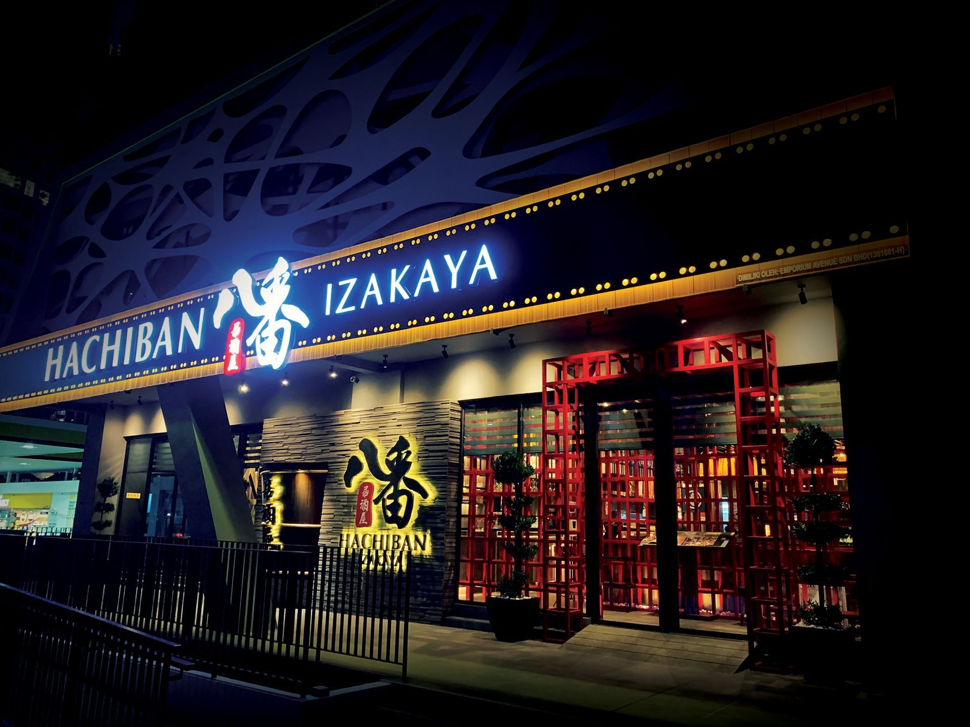
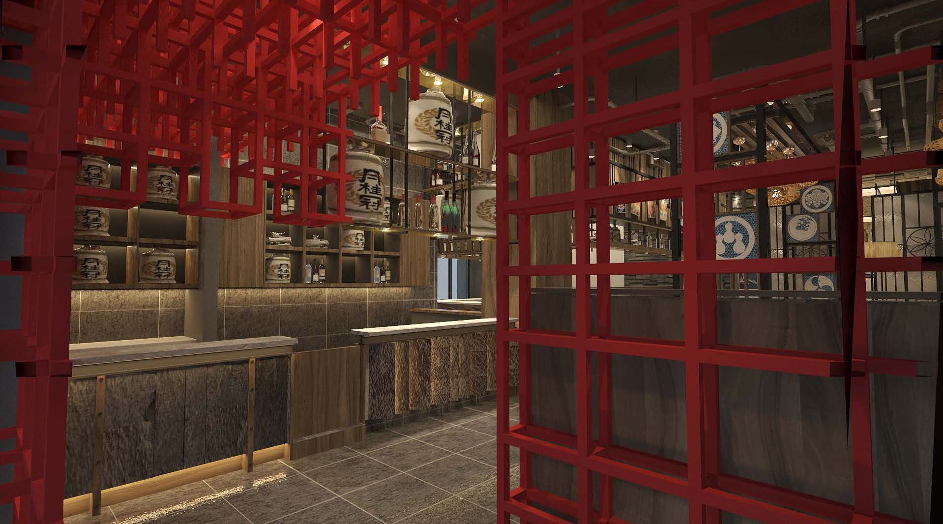
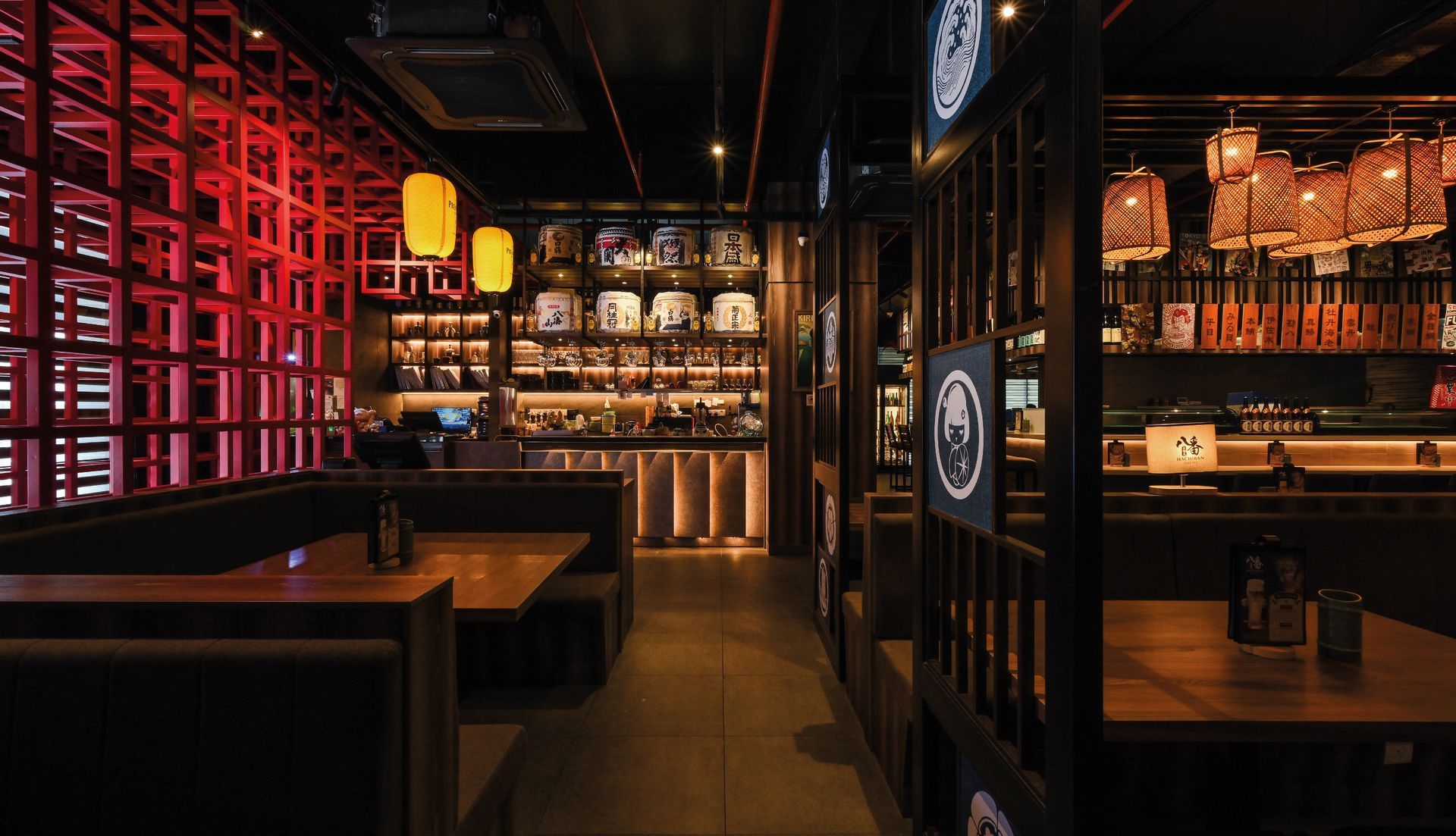
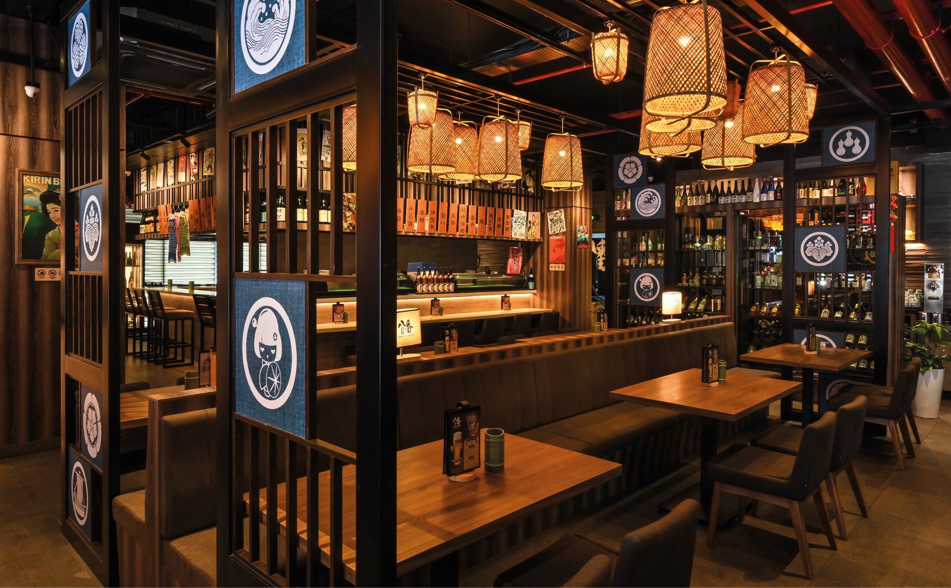
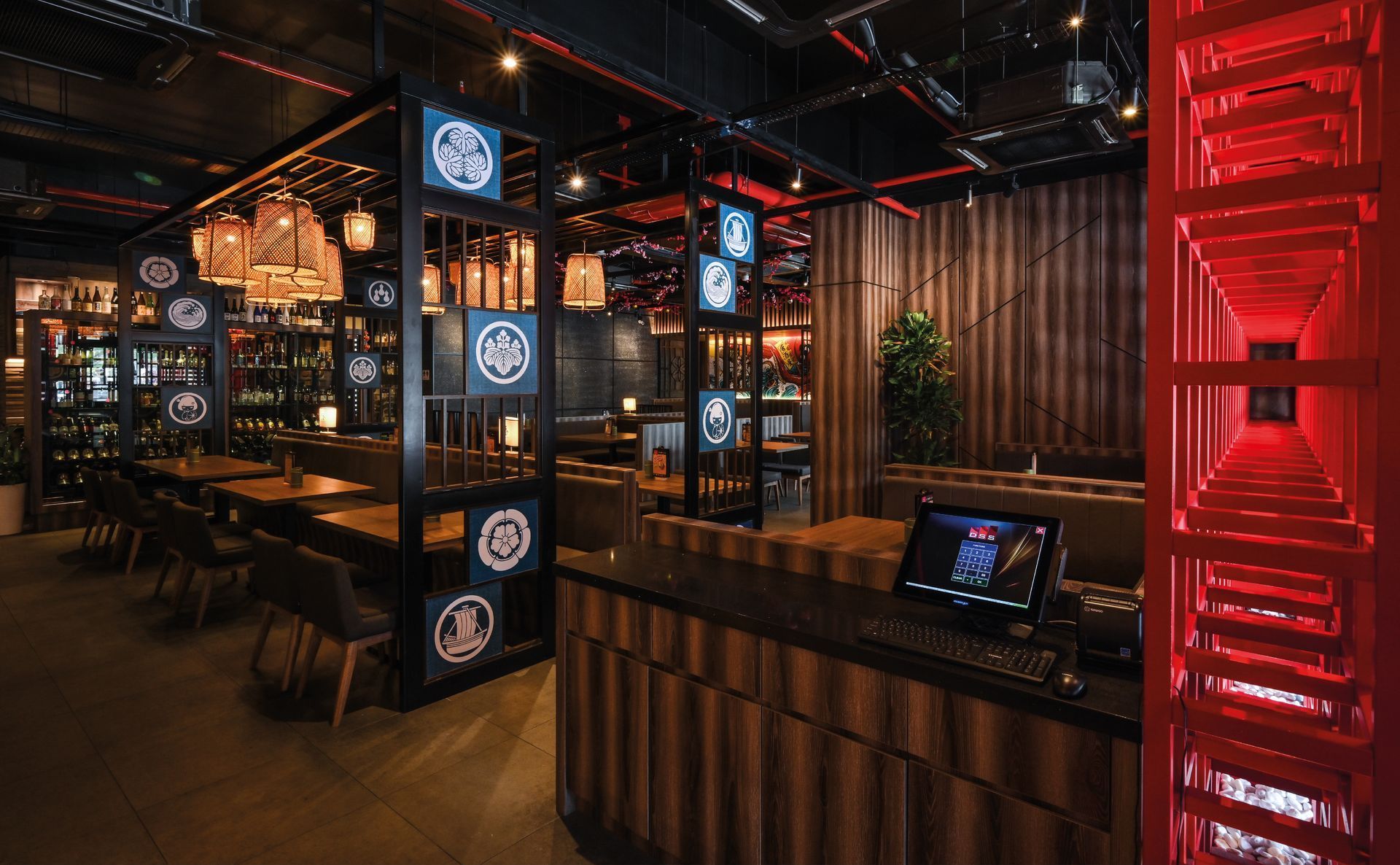
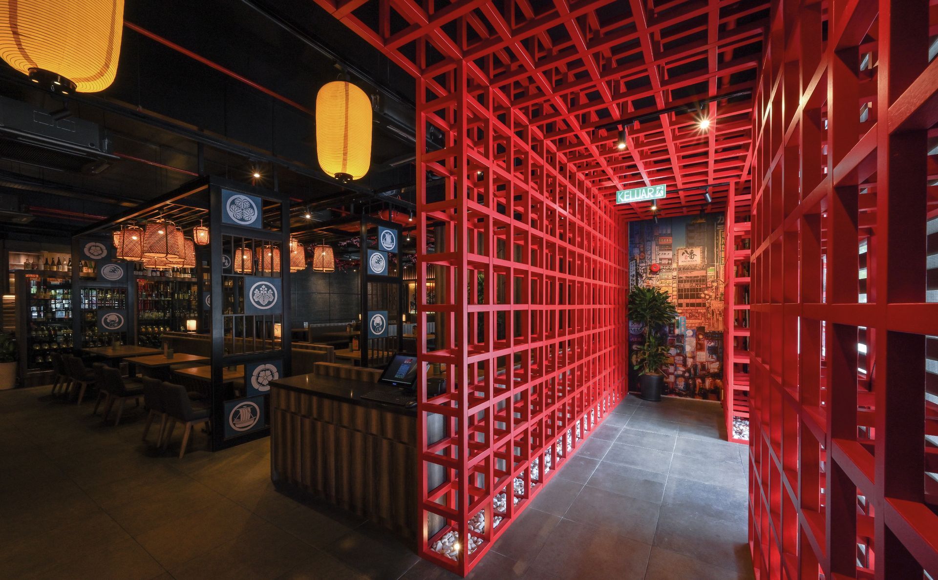
While designing its brand image, we employ a dark color palette. Our aim is to strike a balance between upscale elegance and the lively street charm of an izakaya. We use Japanese fonts and motifs to enhance the well-established traditional Japanese atmosphere.
To align with the brand's image, we emphasize that Hachiban is a comfortable restaurant perfect for unwinding after work. Therefore, the design of lighting is also crucial in creating a Japanese street atmosphere,providing an ideal place for customers to chat and relax.
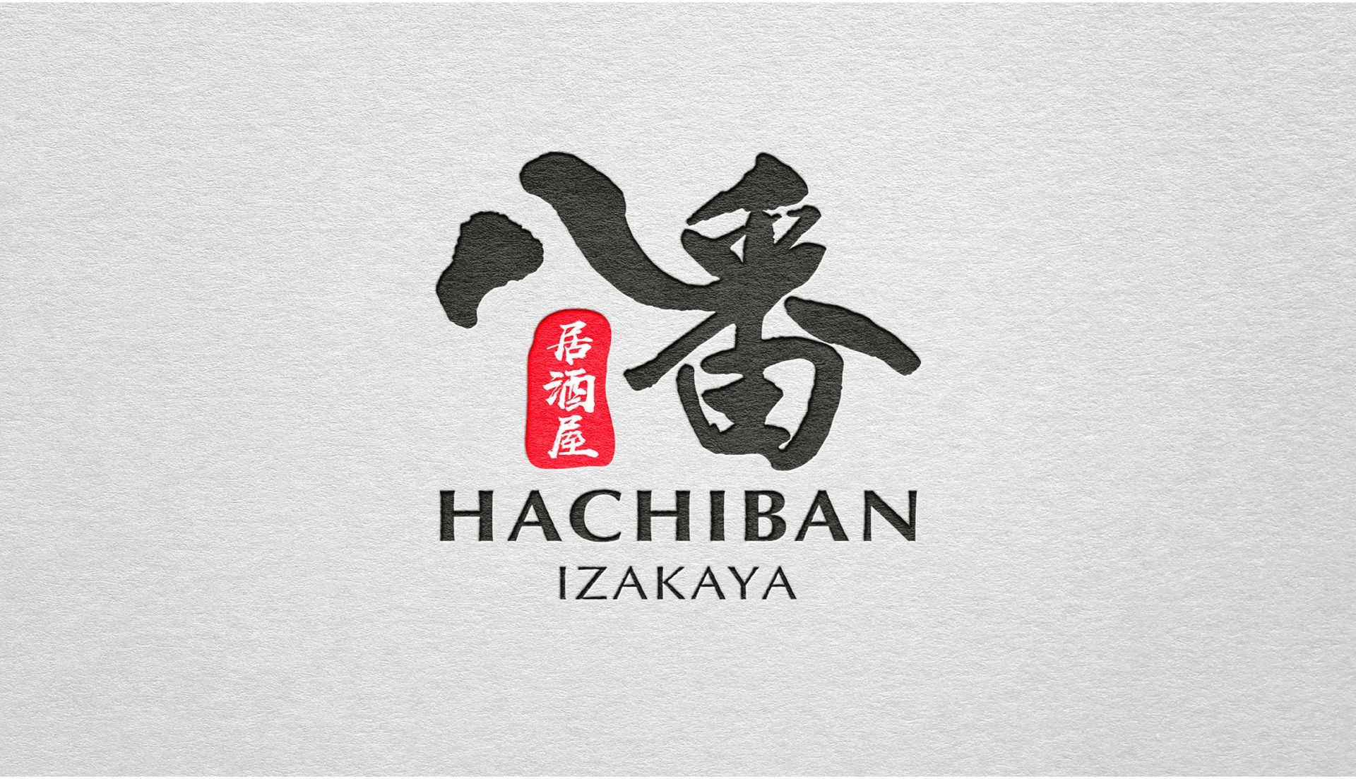
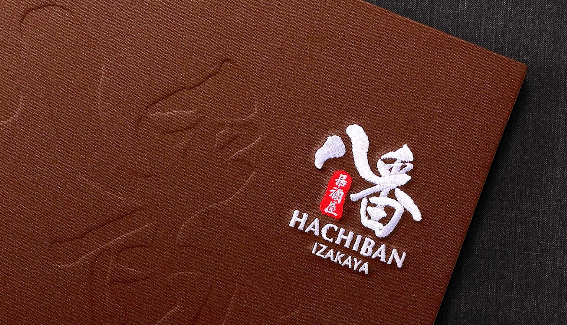
Logo of "八番" Izakaya, inspired by Japanese barbecue culture, lively street charm and traditional calligraphy, aims to create a distinctive and easily recognizable brand emblem with Japanese characteristics.
Hachiban 八番 Izakaya 是一家充满活力的传统日式居酒屋。在设计其品牌形象时,我们采用了黑色、棕色和深红等深色调。我们的目标是在高雅的氛围与居酒屋的热闹街头魅力之间取得平衡。我们使用了日本字体和图腾来增强店内传统日式氛围。
为了与品牌形象相符,我们强调 Hachiban 是一个舒适的餐厅,非常适合下班后放松身心。因此,灯光设计在营造日本街头氛围方面也至关重要,为顾客提供聊天和放松的理想场所。
八番居酒屋的 Logo 设计灵感源自日本烧烤文化、日常生活化、街头风情和传统颜色,以创造一个富有日本特色且易于辨识的品牌标志。